May 24, 2005

Mies Bands...Realized

So I finally placed an order for the bands; 1000 grey silicon wristband sporting the phrase "What Would Mies Do." It was scary. Putting up $1000 not knowing what the outcome would be. Perhaps I'll enlighten you with some questions that ran through my head:

What if the bands are a scam and they just steel my credit card number?
What if the bands are crappy and break easily?
What if nobody likes the ideas?
What if there is a sudden movement to ban bands?
What if they spell everything wrong?

Scary, but they arrived safely and correctly, the color was just a little off but that's rather minor. The fact that they arrived early and individually packaged made up for it. One the bands were in we started planning where to sell and how to sell. I made ads and the Mies Society compiled a list of events where we could sell bands. In addition, I met with the Architecture College Board of Directors to pitch my idea and to see if they would allow me to visit their firms in the fall to sell bands. I think it went well. Our first event, IIT Open House, sold around 100 bands which was nice. I made spreadsheet to track all sales and placement if bands. Rem Koolhaas was given one and wore it on campus, that made my day. To know that a product I developed made it onto the wrist of one of the worlds most famous architects; it's a nice feeling.

Rumina (Room-in-a) Chair

Below I have posted pictures of the finished cardboard product. Apparently there is already a cardboard furniture market. There was a recent article in the newspaper about 2 brothers who started a business making cardboard furniture. Also, I saw some cardboard shelves at the Visitor Center in Chicago's Water Tower Place. These shelves were reinforced with a thin plywood or board which was disappointing. I'll still work on some ideas but I'm going to research a little more to make sure I'm not replicating something already made. While building this chair I noticed some structural instability in the layered cardboard. If it wasn't properly glued, it would fall apart. This can be solved with a better gluing technique. Overall, I'm satisfied with the out come of this chair, it's been a great learning experience.

Apr 10, 2005

Mies Ad II


Less is More. The message is simple and bold. The pointilated profile gives an interesting viewpoint, as if Mies is looking at the words. IIt is also inspiring. The idea behind the pointilation is to play off the restoration of Crown Hall. As if to say, When Crown Hall is restored, so will Mies' image. I am currently working on some adds that will incorporate Crown Hall into the ad.

Mies Ad I


This ad I designed to go inside a display that would accompany the Mies Society Bands. I like this ad because it is bold, yet has a sense of humor. It shows Mies as a relaxed figure with a boldness added by the text font. Also, the fact that he is wearing a Mies band kind of plays off the heading. The question is What Would Mies Do? Would he buy a band? The picture answers yes, yes he would, and he would be damn proud of it. The display will most likely be placed in a high traffic convenience shop location. When someone is in line waiting for the a coffee or a bagel, they might look at a sign for 5-10 seconds. So the ad needs to be short, interesting, and to the point. It answers what the product is, where the money goes, and how much it costs. Simply and with interest.

Mar 25, 2005

Bad Ad

Today I am going to talk a little about advertisement because a very important student organization let me down today. That organization would be the Student Entrepreneurship Association. On Monday I saw for the first time, the word Entrepreneurship on campus. I got excited, finally a chance to learn some new entrepreneurial skills. I was a little disappointed with the attempt to sway students to attend this event.

Let's talk about this sign for a moment. First off, they used Word Art. I used word art once, I was making a report cover for my 5th grade presentation on Abraham Lincoln. I'm surprised a nice clip art image didn't accompany this poor display of advertisement. Second, they used bullets, as if we were going to attend an office meeting regarding this quarters figures and the downsizing of a corporation. This, along with the Ariel Bold font, really makes the event uninvited and uninteresting. But above all, even the fact that it's not centered, is the issue of information presented. OK, we know it;s Entrepreneurship Week 05', and we know that between March 24-27 there will be some events. Great, but where are the events? What time of day? How about a contact? A website would even help.
Well on the following Thursday I found a small stack of little papers with a schedule of events on them, for the events described above. Alright, that's good, they got a schedule out to the public, listing events and times and locations. But the problem now is, the events start today, and now I have today all planned out. Maybe if I had this on Monday, rather than a poster that told me nothing, I'd been able to plan my attendance. Also, these papers where scattered all over the MTCC. Now they are just getting annoying. Instead, why don't you create something to hold them, so that people can take one if they want one. Maybe they could have a neat graphic that will interest people and make them want to pick up a schedule. NOT Word Art.
Alright, now I got my schedule and I can plan on attending Fridays events. They are having an elevator pitch workshop at Noon at the HUB. Well the HUB is a big building but I figure there will be signs telling me where to go when I get there, or a greeter or something. Nope. I get there at 11:50 on Friday, not a sign, not a greeter, not a clue. There's a small group of people by the couches, could that be them? There seems to be a group inside one of the ballrooms but they are all older and they are already in progress, so that's not them. I walked around for 20 minutes, then left with no success in finding the workshop. If it was the group on the couches, I'm convinced they were all part of the association because nobody not in that group would have had a clue as to where to go. Pathetic. It's like they didn't want anyone to come to there events. Normally I wouldn't just write about an organization, but I expected a much better display from a group of people who call themselves entrepreneurs. I guess this is what you get at a tech school. I thought about joining the association before, but no I don't think I want to be part of an organization that can't even organize an event properly.

Mar 24, 2005


I have been contemplating the trailer restoration venture again lately and I've come up with a name and logo. The name I have selected, Trailer Made, is a playoff of Taylor Made golf equipment. My first inclination was Trailer Trash but then decided against it considering it's derogatory tone. The logo is simple and vibrant. I think it fits well with the remanufactured Mod trend that is currently rising.  Posted by Hello

Mar 2, 2005

Concept II


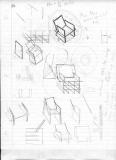
This sketch shows the latest concept for the competition entry. Basically, it's a couch that can turn into a set of 4 chairs, a table, and a bed. The idea is to maximize the usability and minimize cost. Because the "chair" has so many functions, it eliminate the need to purchase other furniture resulting in less packaging, less cost, and less wasted materials. It's both environmentally and cost friendly.

Mar 1, 2005

Rolling Start

Well the ball is officially rolling. Today I confirmed the first cardboard donation for the chair project. I think that this school project will be very good for me and perhaps in the future, I'll be able to start a cardboard line. That's the hope for this summer anyway. If I do win a cash prize from the school competition, that will serve as seed money for the summer project as well. Right now I am focusing on getting all the pieces I need to fabricate the chair. I've set up a schedule for this assignment:

week 1: Conceptualize
week 2: Plan
week 3: Obtain Donations
week 4: Fabricate
week 5: Presentation Boards
week 6: Submit

I actually wasted a lot of time working on class work, so I guess it wasn't wasted, but none the less I have a lot of catching up to do. So, it's back to the phones...

Feb 27, 2005

Concepts


Here are some ideas I sketched up for the cardboard furniture line, I really like the dark one...but I"m still working on ideas. Posted by Hello

Feb 23, 2005

New Venture

I'm taking a temporary break from the whole Marc and Ty's scheme for a little while to work on an independent project. Currently I am working with the Mies van der Rohe Society to bring a line of products to the public. So far we are just working on a wristband, like "Armstrong", but with the saying "What Would Mies Do?" It's a clever rebirth of 2 past trends that will hopefully strike a cord with many local architects.
It all started one night while I was working at Crown Hall trying to get my drawing done for the next day and someone walked by with an "Armstrong" bracelet on. I started thinking about the trend and remembered how popular the "WWJD" bands were in middle school. It was about 2:00 AM and I laughed to myself and thought "What would Mies Do? Would he keep drafting, or would he just quit and go home?" I decided it had potential so the following weekend I started studying how much it would cost to make the bands. After determining it was possible I figured I needed help, so I E-mailed the director of marketing at the Mies Society and set up a meeting for the following Monday.
It was the first meeting I ever had to attend on my own. I've been to meeting before but always had someone there by my side to help me out. Needless to say I was nervous. I started thinking my idea wasn't really good and what if I wasn't prepared. I talked to my family a lot and they helped calm me down and prepare me for my meeting. I printed up analysis sheets and a meeting agenda so that I would know what to say at the meeting. The meeting went great. Justine, the marketing director, made me feel comfortable and made my first meeting a great experience. She loved the idea and she has thinking about an entire line of "WWMD" merchandise. We are reconvening next week to discuss our options and where to go from here.

Current Ideas:
Mies face Cufflinks
Mies face Tie Tack
Mies face drawn Tie

Jan 30, 2005

Pre Start-up

Things have been pretty slow lately, which is understandable being that Tyler and I are 200 miles apart not to mention swamped with homework. Despite the drawbacks and lack of motivation/inspiration, there has been some progress. I finished Richard Branson's autobiography this weekend and if there is one thing I took away from it, it was a better understanding of money. When he started Virgin, he didn't start by opening a Megastore, he started very small with a catalog company. Reflecting this newfound understanding on to Marc and Ty's, we need to start small, and soon. Being our age and having no collateral, it would be near impossible to get a bank loan, so opening an actual store is not an option as of now.

Current goal: Find a starting point venture. Right now we need to focus on gaining an initial capital. Something the we can reinvest in the company, therefore creating growth. So, Tyler and I had a meeting and discussed possible options:

Craftshow Startup- Pretty much self explanatory. Find a product to make or sell, and find some open shows and flea markets to get our product out there. If nothing else, we will gain experience and contacts. Possible Products-
Foamcore Table
T-shirts
Refurbished Furniture
Retro Pillows

Unique Service- Any service which we are capable of carrying out with little or no overhead. This type of business has the benefit of being portable, in other words, we don't need a set location or office.
Possible Services-
Study Help Center
Party Hosting
Clothing Website

After reviewing all the possible options available to us, we decided to choose one option from each category. We figured that hosting a party and making tables to sell at craft shows were are best bets. The tables are easy to make and can be made cheaply meaning we can sell them cheaply. They also have a certain appeal that, for a price, is worth having. Also, being that they are made out of a paper base, it is possible to print virtually anything on the tables making the sky the limit. We chose to host a teen party as well because it will provide us with important market research that will aid us later in the development of Marc and Tys.
Now that we have decided on ventures to pursue, the planning begins. Hopefully we will be able to kick into action the day school ends, but for now it's on to some research and planning.