Today I am going to talk a little about advertisement because a very important student organization let me down today. That organization would be the Student Entrepreneurship Association. On Monday I saw for the first time, the word Entrepreneurship on campus. I got excited, finally a chance to learn some new entrepreneurial skills. I was a little disappointed with the attempt to sway students to attend this event.

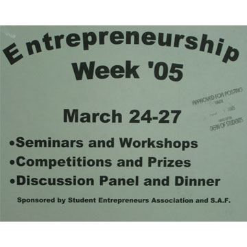
Let's talk about this sign for a moment. First off, they used Word Art. I used word art once, I was making a report cover for my 5th grade presentation on Abraham Lincoln. I'm surprised a nice clip art image didn't accompany this poor display of advertisement. Second, they used bullets, as if we were going to attend an office meeting regarding this quarters figures and the downsizing of a corporation. This, along with the Ariel Bold font, really makes the event uninvited and uninteresting. But above all, even the fact that it's not centered, is the issue of information presented. OK, we know it;s Entrepreneurship Week 05', and we know that between March 24-27 there will be some events. Great, but where are the events? What time of day? How about a contact? A website would even help.
Well on the following Thursday I found a small stack of little papers with a schedule of events on them, for the events described above. Alright, that's good, they got a schedule out to the public, listing events and times and locations. But the problem now is, the events start today, and now I have today all planned out. Maybe if I had this on Monday, rather than a poster that told me nothing, I'd been able to plan my attendance. Also, these papers where scattered all over the MTCC. Now they are just getting annoying. Instead, why don't you create something to hold them, so that people can take one if they want one. Maybe they could have a neat graphic that will interest people and make them want to pick up a schedule. NOT Word Art.
Alright, now I got my schedule and I can plan on attending Fridays events. They are having an elevator pitch workshop at Noon at the HUB. Well the HUB is a big building but I figure there will be signs telling me where to go when I get there, or a greeter or something. Nope. I get there at 11:50 on Friday, not a sign, not a greeter, not a clue. There's a small group of people by the couches, could that be them? There seems to be a group inside one of the ballrooms but they are all older and they are already in progress, so that's not them. I walked around for 20 minutes, then left with no success in finding the workshop. If it was the group on the couches, I'm convinced they were all part of the association because nobody not in that group would have had a clue as to where to go. Pathetic. It's like they didn't want anyone to come to there events. Normally I wouldn't just write about an organization, but I expected a much better display from a group of people who call themselves entrepreneurs. I guess this is what you get at a tech school. I thought about joining the association before, but no I don't think I want to be part of an organization that can't even organize an event properly.